Table of Contents
Synthesis of work on rms slideshows
Translation into English using an automatic translator.
Our work on the slideshows used by Richard Stallman during his conferences is not limited to a simple translation. Listing in detail everything that is done is far too tedious. We therefore choose to make a synthesis illustrated by a few examples to expose our work.
A little story
Initially it was a question of making, at the local level, our own conferences based on those of Richard Stallman. To do so, we needed a slideshow. So we recovered the slideshow that Richard had used for the TEDx 2014 in Geneva. Being French-speaking and since Richard also lectures in French, it was particularly interesting to have a French translation of this same slideshow. This is how the work began.
We immediately encountered the fact that this slideshow was almost exclusively made up of images and that the texts were included in the images. It was therefore necessary to extract the images from the slideshow, edit each image to translate, then put them back in the slideshow. This process would have to be repeated for each correction, translation or update of the slideshow. This would have been particularly tedious. Since we were doing a translation and we were going to do the work, it made more sense to process each image only once, to purge the texts and to include text boxes in the slideshow itself, in order to facilitate any further work.
We were asked the question: 'But why not leave the rms version as it is?' It is precisely because it is difficult to modify. We were also told: “I prefer the rms slides with the sentences written by hand.” U.S. too. However, there are very few handwritten sentences that needed to be erased to allow easy editing. So we deleted the texts from the images.
In the first slides we came across a problem. The bubbles in some drawings were too small to include translations. We were therefore forced to modify the image, in order to give more space in the bubbles when it was necessary. This is how we started working on the images themselves.
As a result of this, we noticed that some images were quite “dirty”. Sometimes there were very clear blue pixels instead of white in the background, other images were blurred. An anomaly also appeared to us when we noticed that the “GNU / Linux 100% free” circle was significantly lower than the other 3 “GNU / Linux almost free” circles. It visually lowered our values of freedom. So we finally decided to review and reprocess any images that needed it.
In the slideshow, we also found that some images were really small and others were badly framed. So we also did this work of readjusting the images in the slideshow. We pushed the vice until aligning the images, where it is appropriate, so that when moving from one slide to another, the basic image does not move.
It all seems like a big job. But it was also imperative not to distort the original slideshow. It is also for this reason that we have kept certain words in English, written by hand, and that we have kept sentences by opting for subtitling. We also kept the tremors or certain small tasks done by the designer to maintain the “organic” side of the drawings.
For the translations themselves, we collaborate with the working group “Trad-Gnu” of April and Richard Stallman whom we thank very warmly.
Some illustrations
Example 01
One of the best examples is the following image. Click on images to enlarge.
The aberration of the background of this image is not necessarily very visible, so here is the same image where we have accentuated this aberration to make it more visible.
We have therefore corrected this defect. We also had to redo the ghost which was completely blurry and distorted. To do this, we took a ghost, the snowmen and the IBM logo from other slides to reconstruct the image. Here are the results for the 2016 and 2018 versions of the slideshow.
Example 02
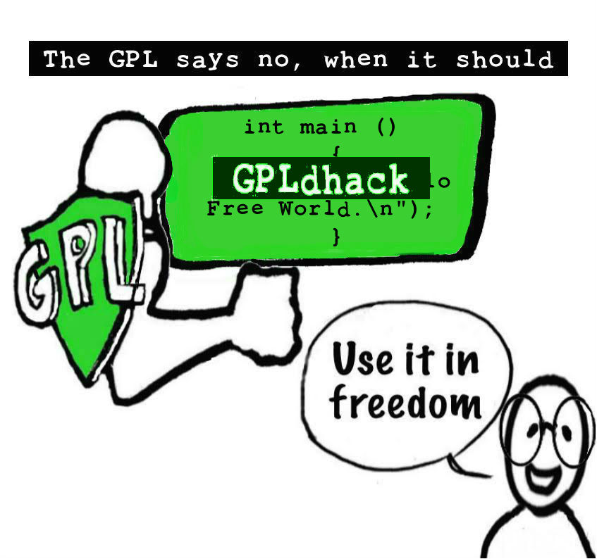
Here is another example which is less obvious regarding the following image. Click on images to enlarge.
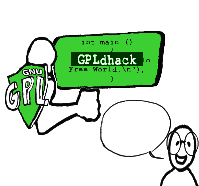
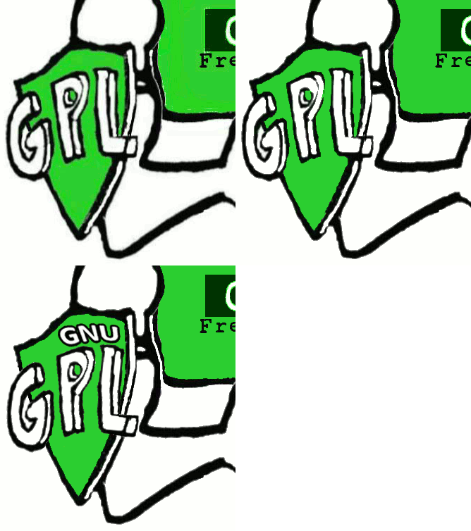
You can see that there is a little blur around the arm and the shield. You can also see wild pixels around the inscription “GPLdhack”. Finally, you can see that the light green color is not solid and that the background white is not very white like in example 1. We have corrected all this. This is the result of the 2018 version of the slideshow.
To make this correction more visible we have created a small GIF animation of 3 images (1 image per second). Image 1 is the original image, image 2 is the 2016 version and image 3 is the 2018 version with the addition of “GNU”.
Example 03
This example illustrates a correction of the drawing itself. The first image is the original drawing. Note the extension of the vertical lines above which break the perspective effect. There is also a line extending on the back. By eliminating these we find the perspective effect initially wanted by the designer. The second image is the result.


